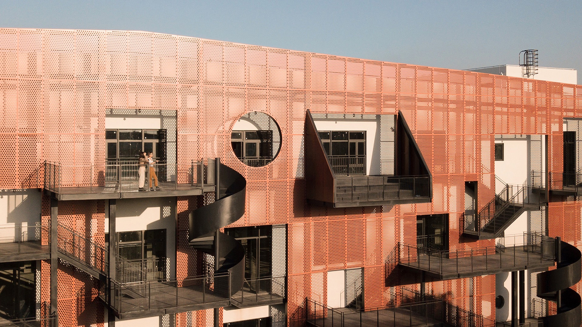
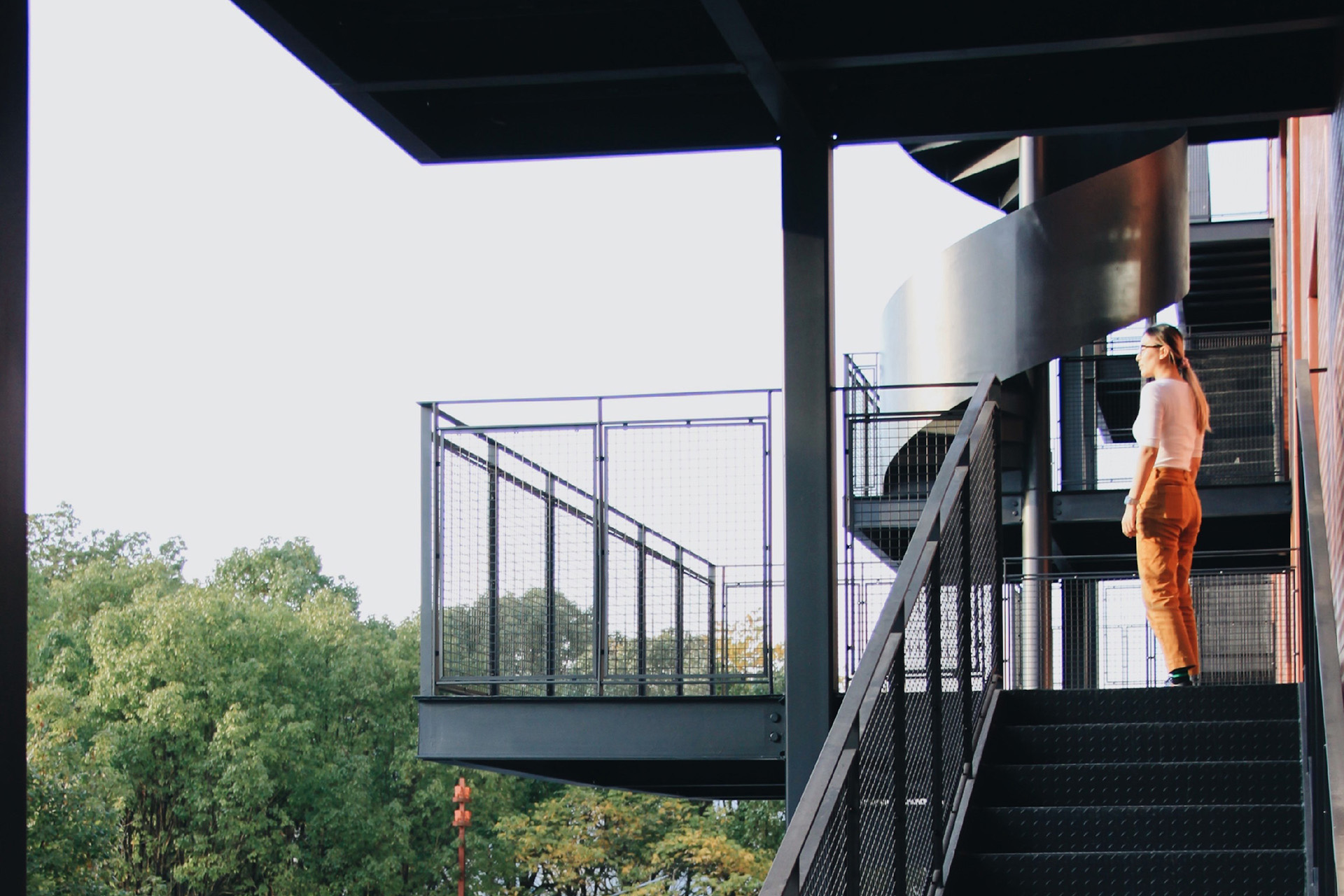
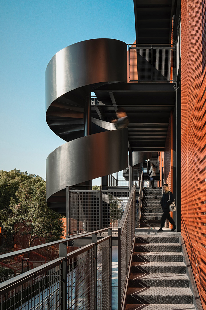
The idea of socializing on the wall comes from New York’s outside fire escape stair parties. Anyone who has seen the movie “Breakfast at Tiffany’s” will remember the song “moon river” by Audrey Hepburn.
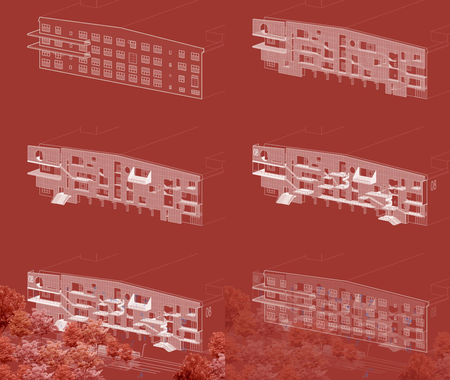
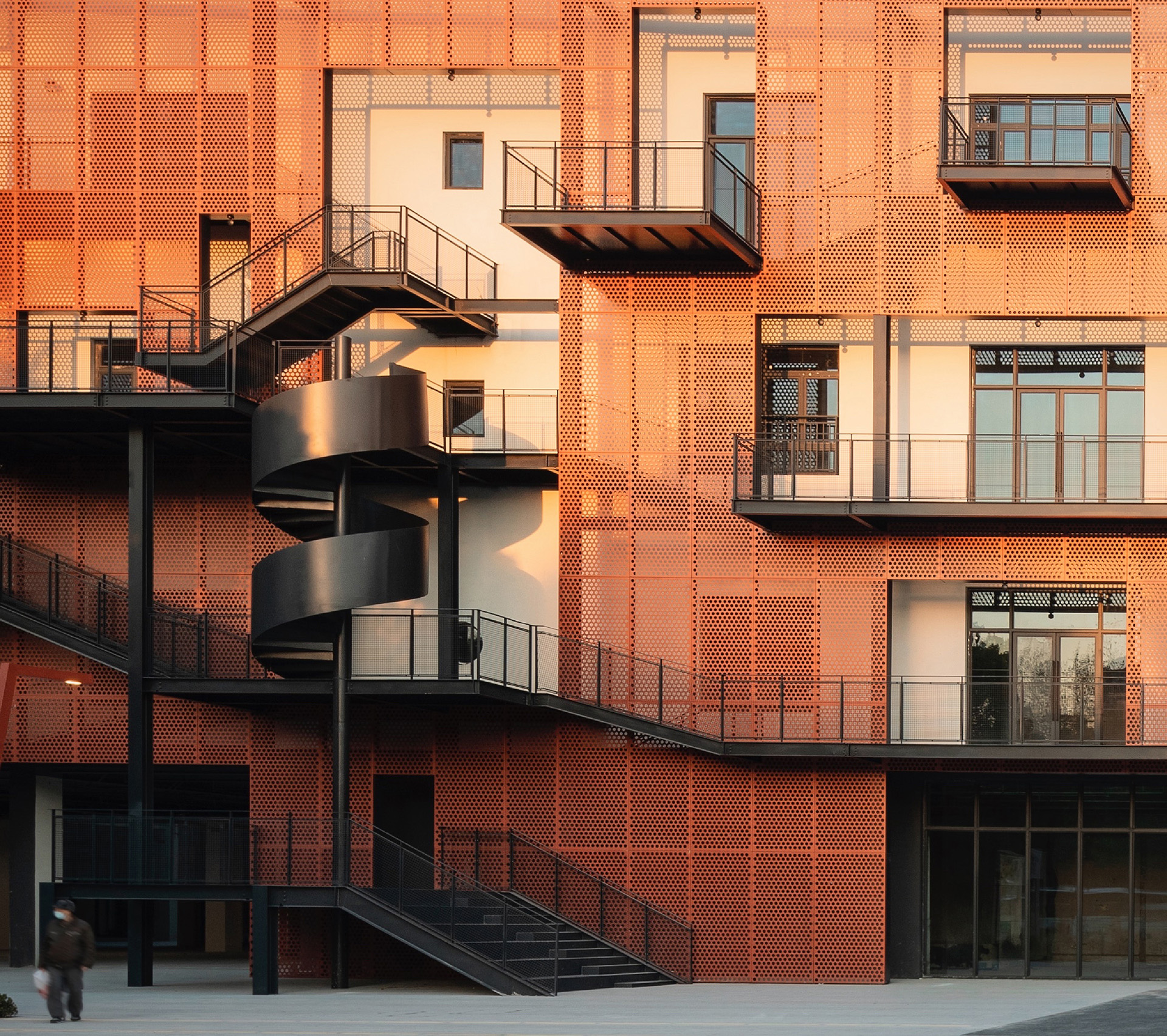
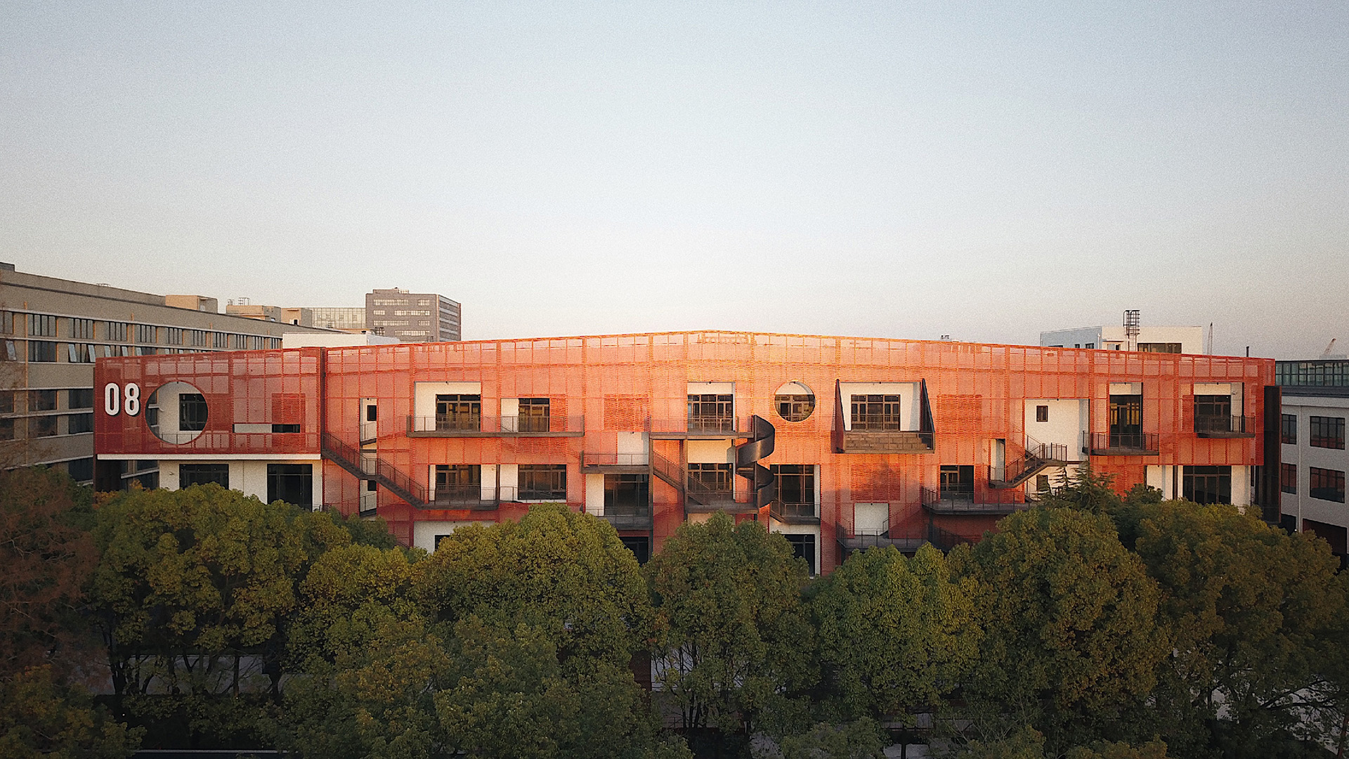
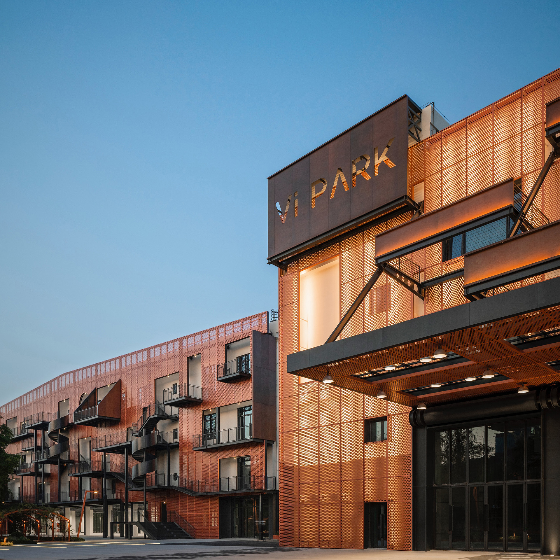
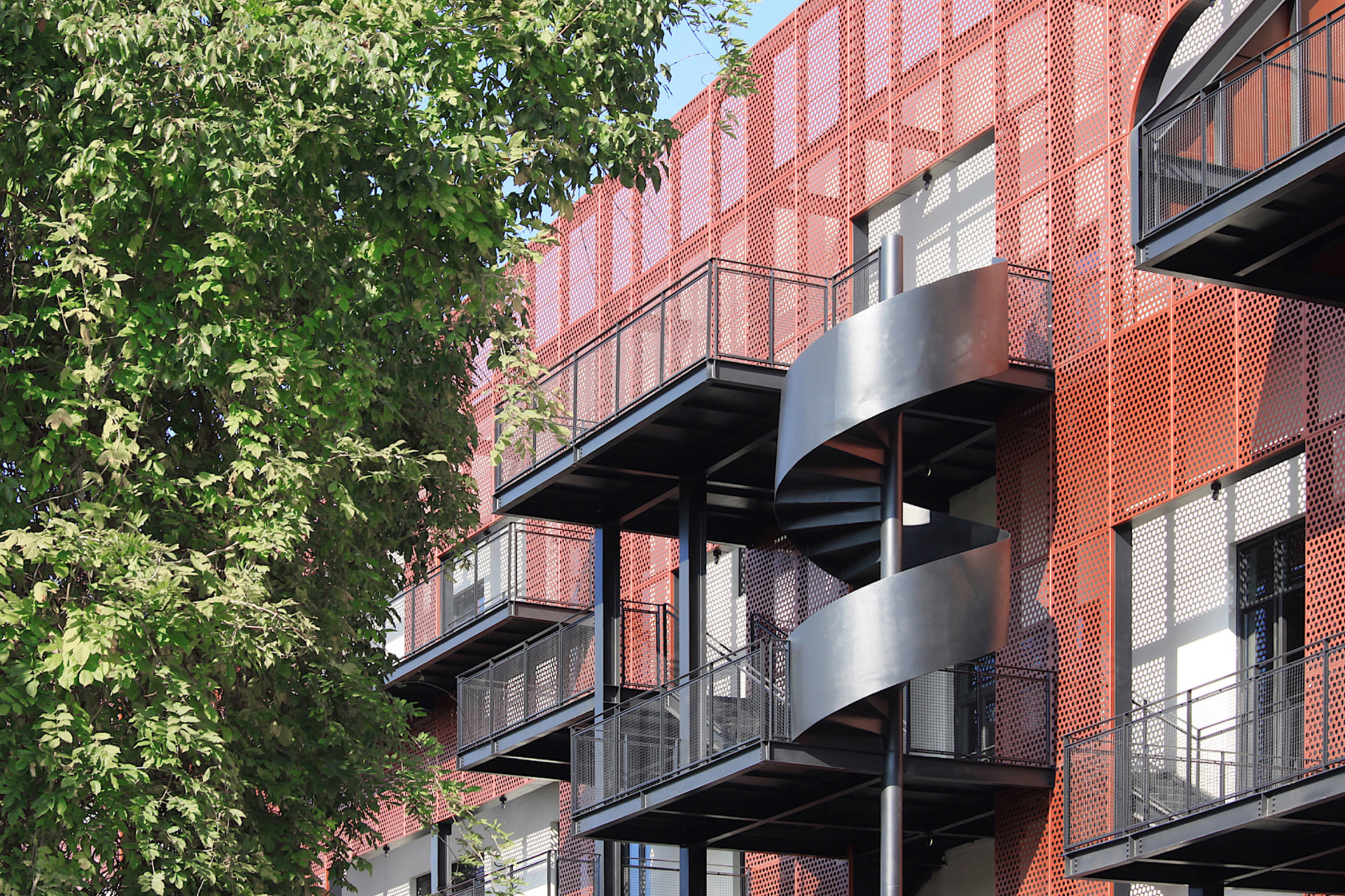
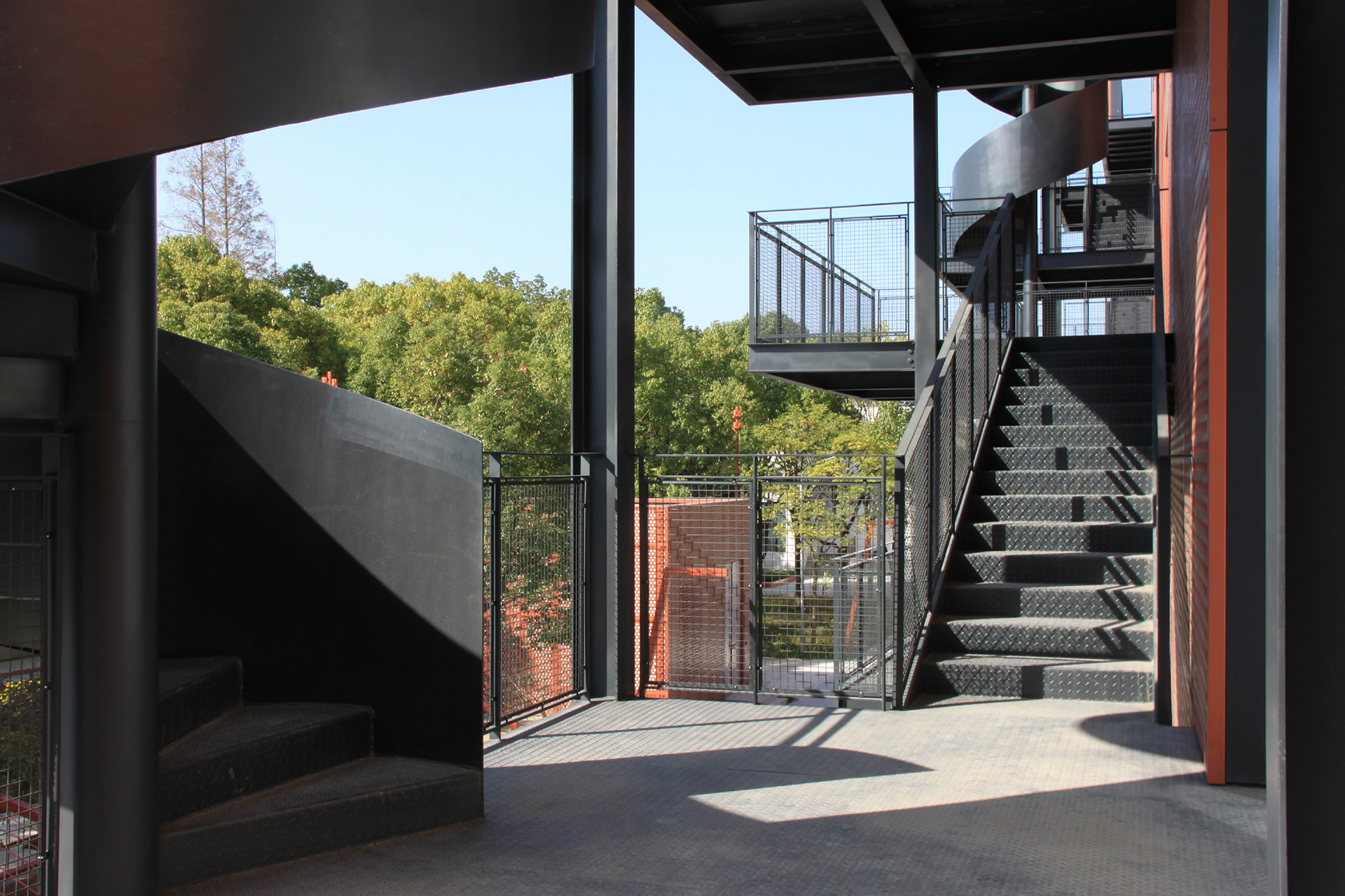
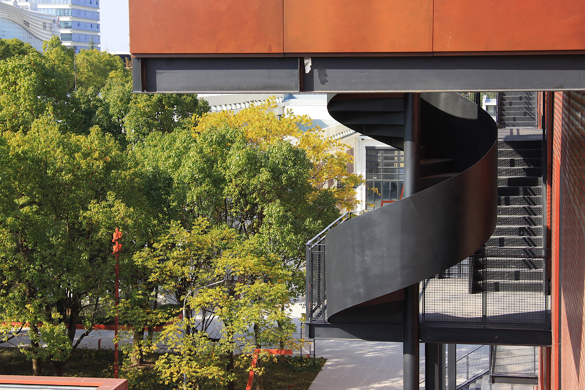
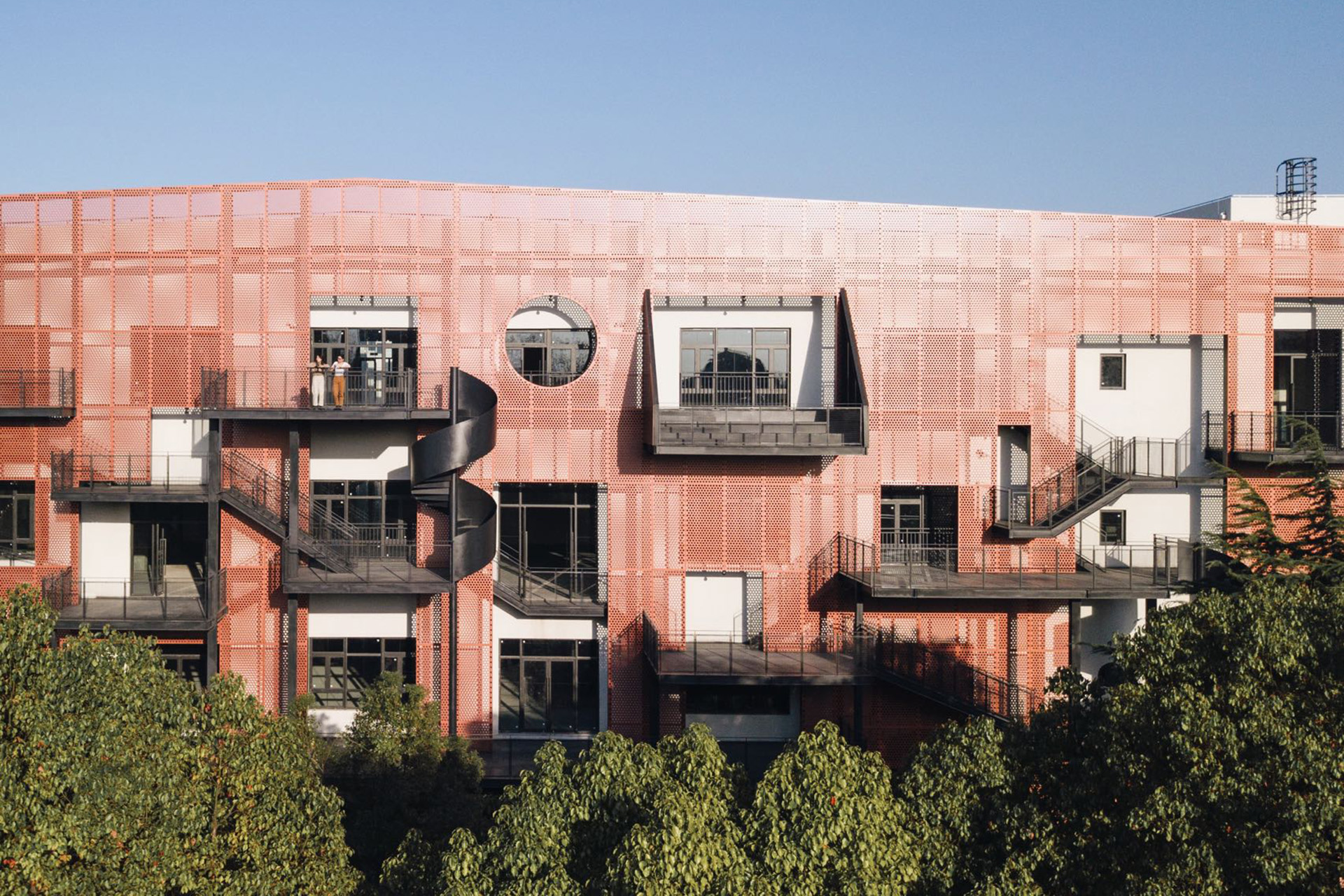
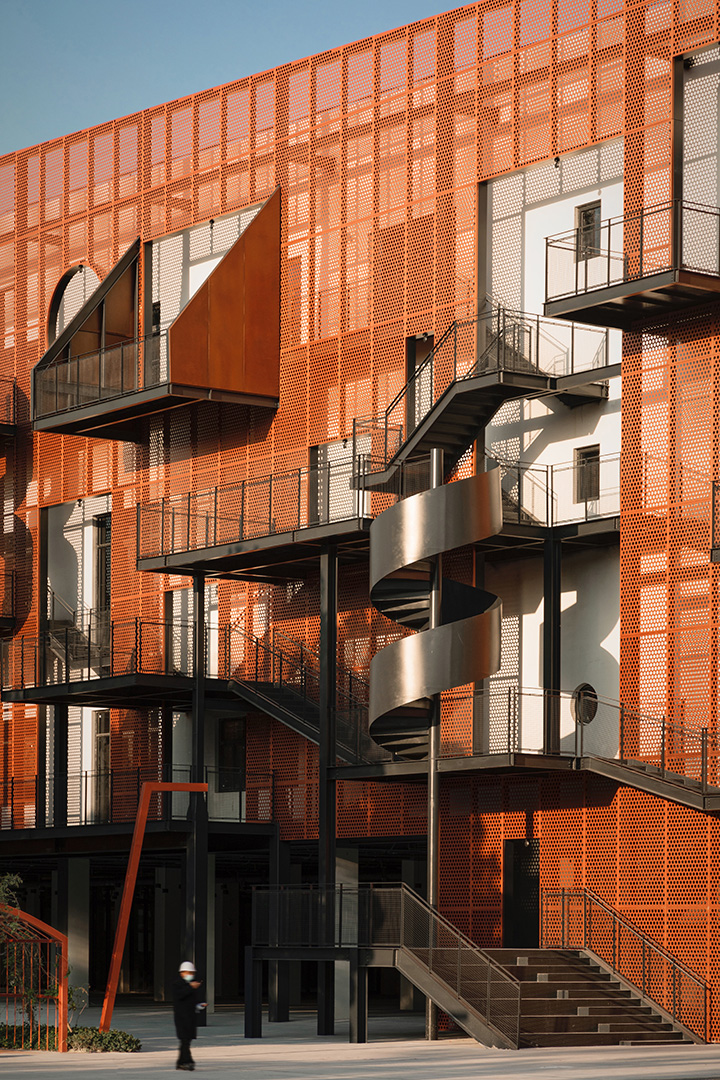
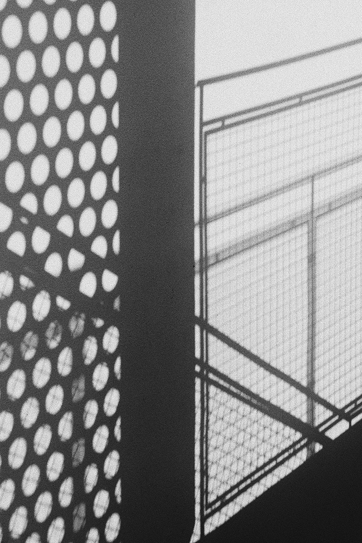
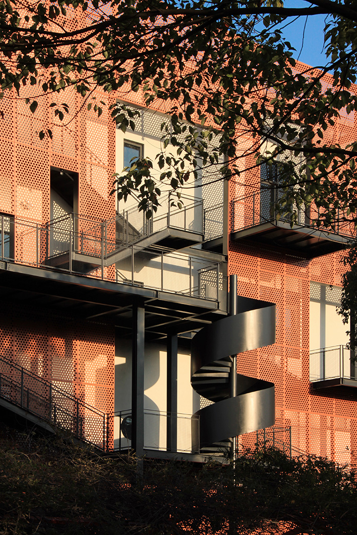
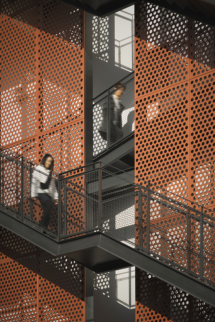
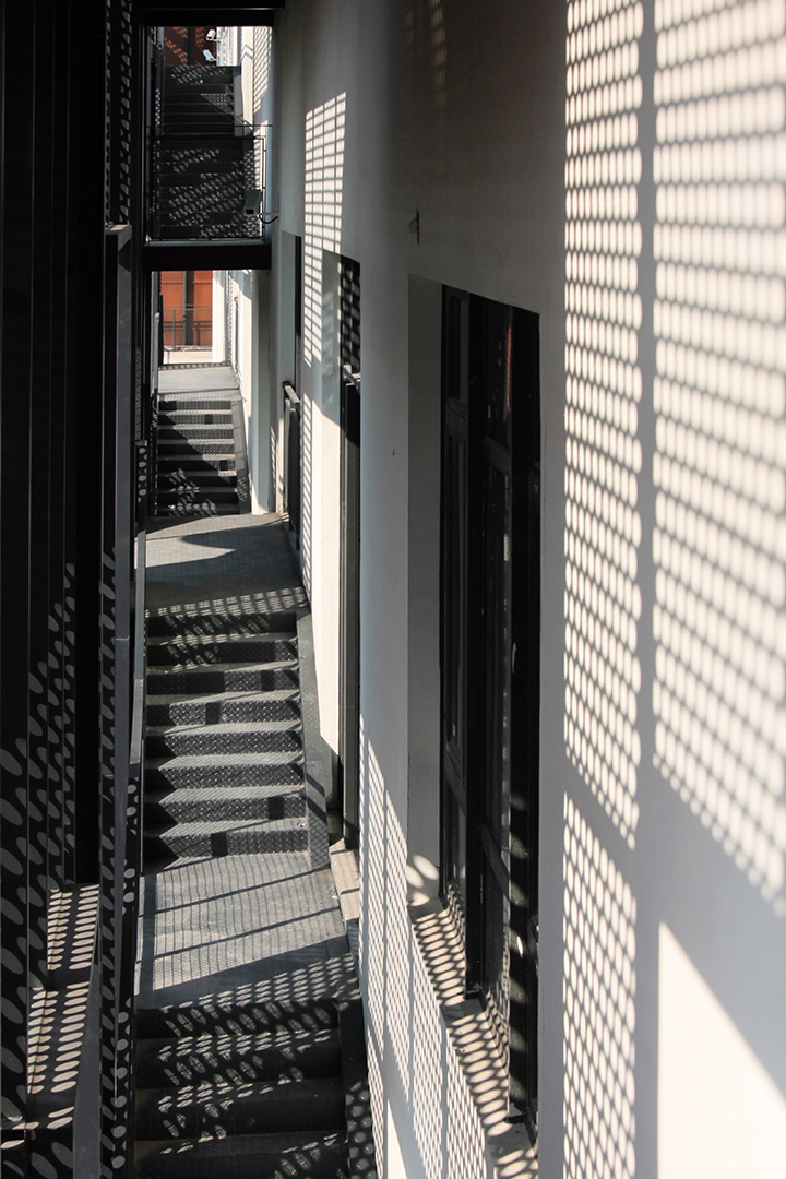
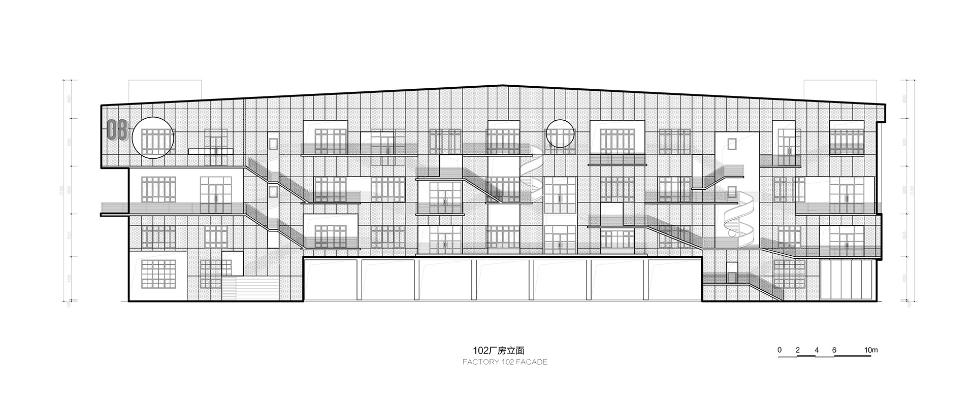
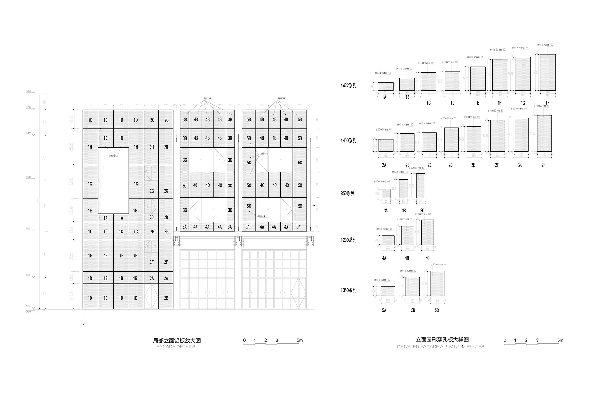
In our case, it is not only for egress, but also has an abundance of fun to navigate. Nearly half of the paths are hidden, and from the outside, the platform paths seem to inexplicably break off, creating a maze “Wall Maze”. To minimize changes to the original structure, the wall is a layer of perforated aluminum panels added out. It is also intended to leave some possibilities for future climbing plants or unit planters.
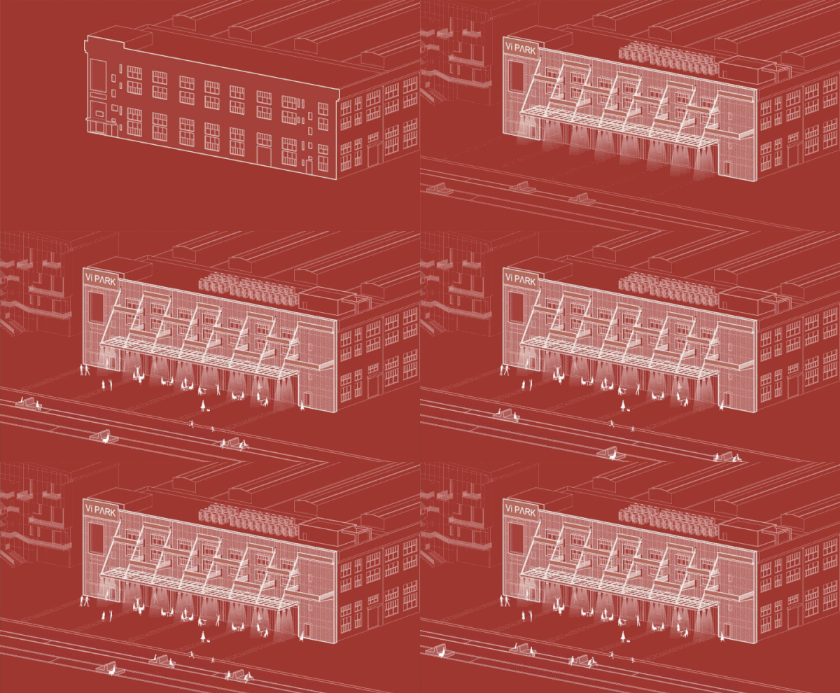
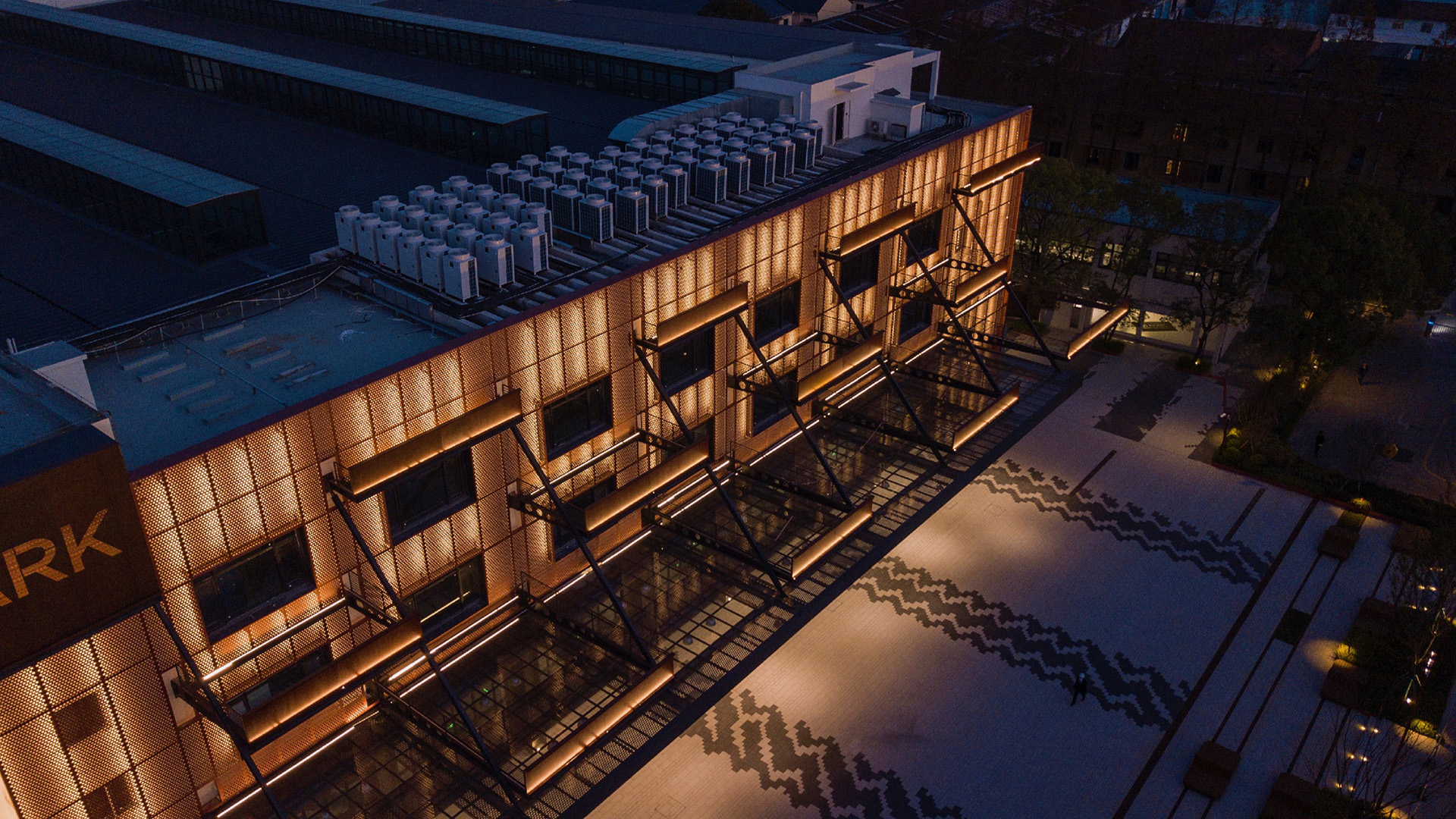
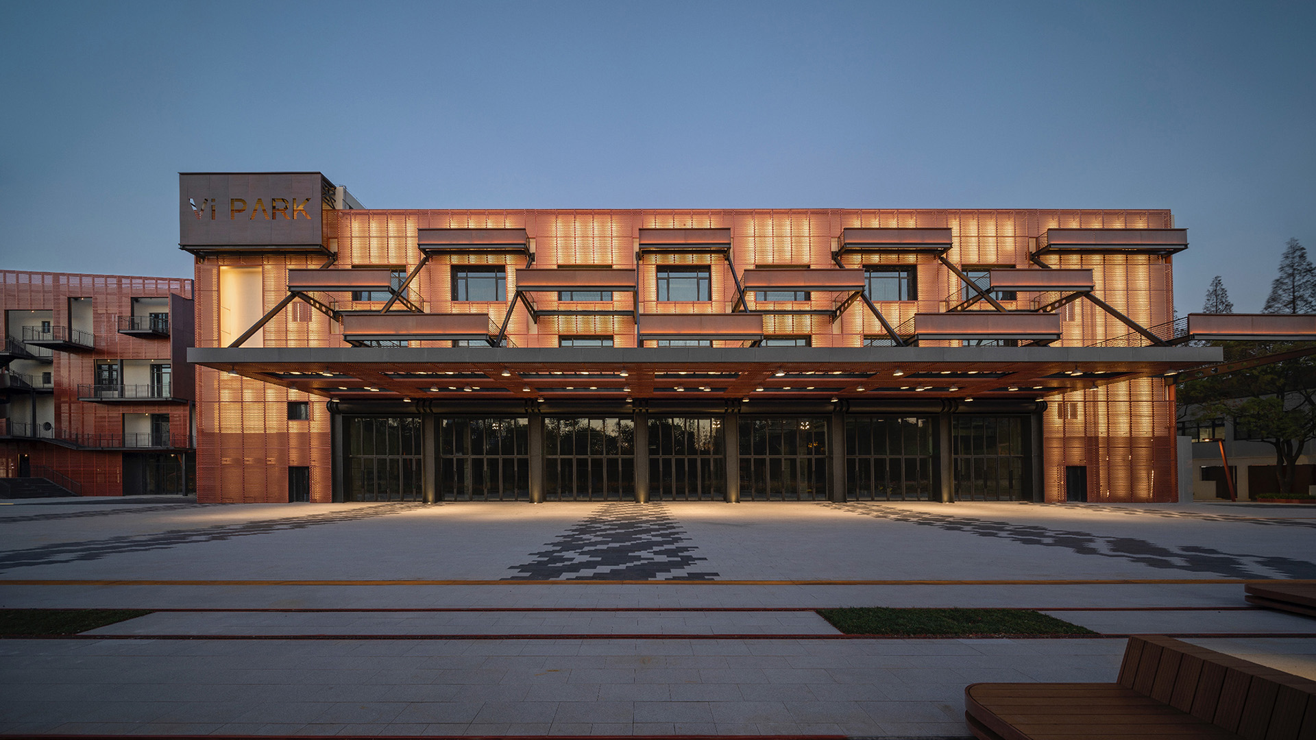
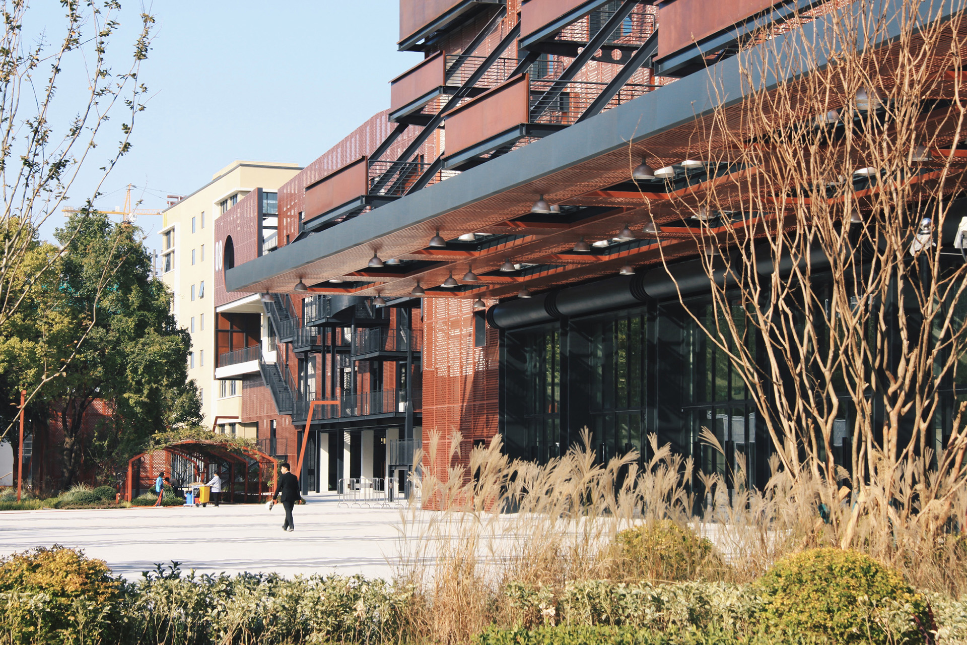
The factory building next to the labyrinth wall is directly in front of a square, which is an excellent venue for street-level display surfaces as well as for holding events. We designed several balconies in conjunction with the open window locations, whose baffles serve as logo signs for the brands of the incoming companies.
The façade looks like it has been lifted off, picking out a huge canopy that serves as a gray space for square activities. This shape is a tribute to the original shape of the factory façade. We hope that the façade renovation will not only shape the new appearance of the building, but also bring new scenes of use to the space.
